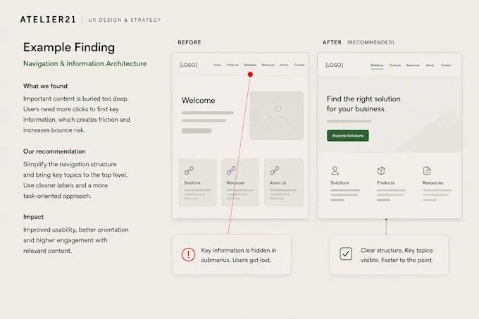
Navigation and labels
Can people find things under the names they would use themselves?


We walk through your site or app the way your customers do and mark every point where they hesitate, misread or give up. You get those points in order of what they cost you – with a fix for each.
What we check
Can people find things under the names they would use themselves?
Every field, error message and step between interest and enquiry.
Does the page answer questions in the order people ask them? Claudia Smolinski checks headlines, microcopy and tone.
Where prospects drop out – and what made them leave.
What catches the eye first, what gets missed, and whether the interface looks as trustworthy as you are.
Obvious WCAG barriers get flagged on the way. The full test is the accessibility audit.
UX audit
Sometimes one journey hides the most expensive problem; before a relaunch, it pays to look at everything. We agree the scope on the free call, based on the decision you need to make.
Design and copy come from the same two people, so a finding never ends at “unclear”. It comes with a concrete fix, ranked by impact and effort – at a price fixed before we start.
How it works
You send a link, we take a first look together and agree what the audit should answer.
Page by page, on desktop and mobile: navigation, journeys, copy and design.
Every finding with what we saw, why it matters and how to fix it – in order of impact.
New designs in Figma and rewritten copy, until the important problems are gone.
Experience
Since 2010, Sebastian Herth has worked inside large digital product teams, where a small change reaches a great many people. Some clients have worked with atelier21 in Germany for more than a decade.
Free · 15 minutes · video
Send us a link and book fifteen minutes. We’ll show you what we see – and whether an audit is worth it.